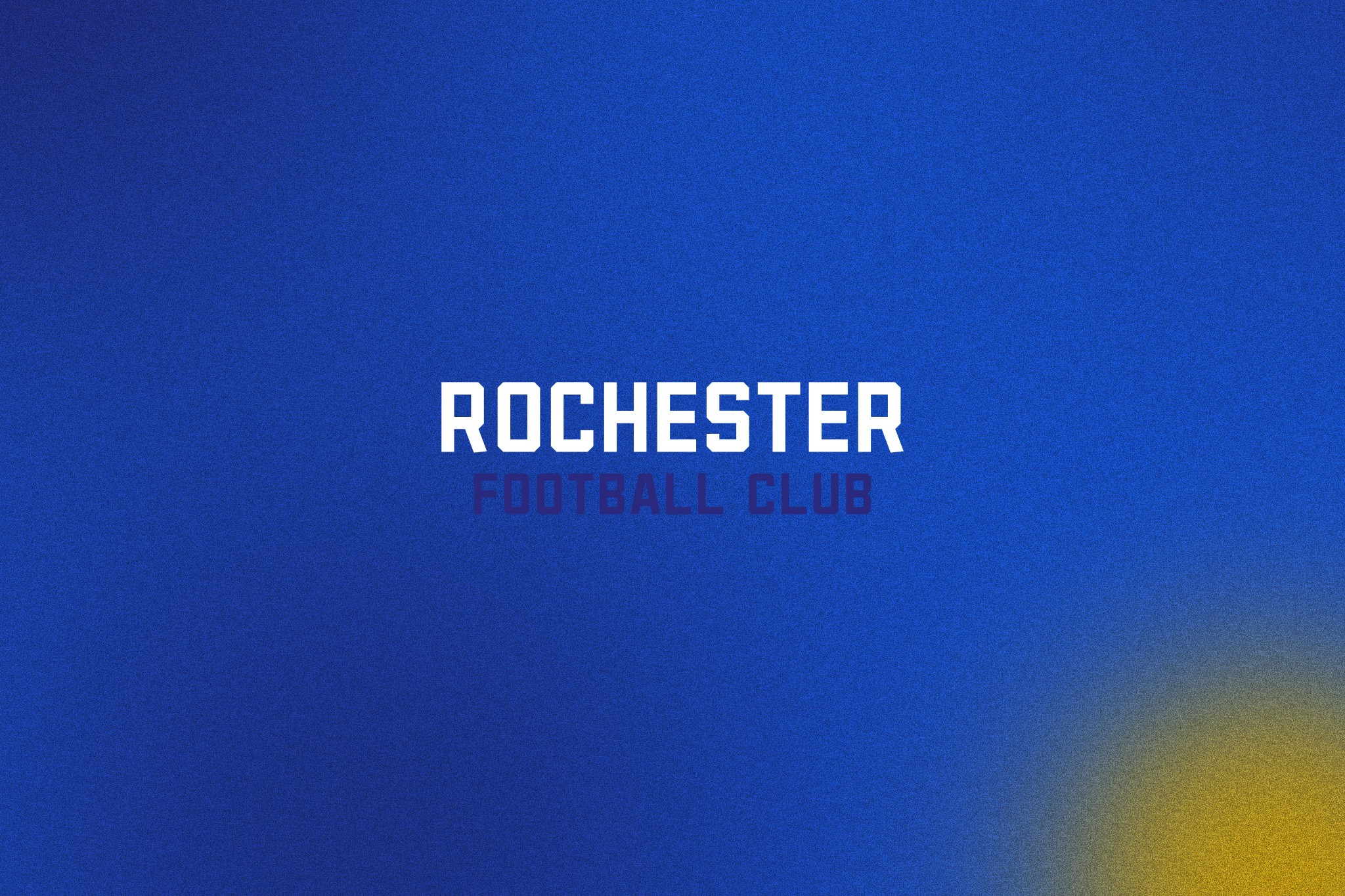
Rochester FC
Brand Design
The Project
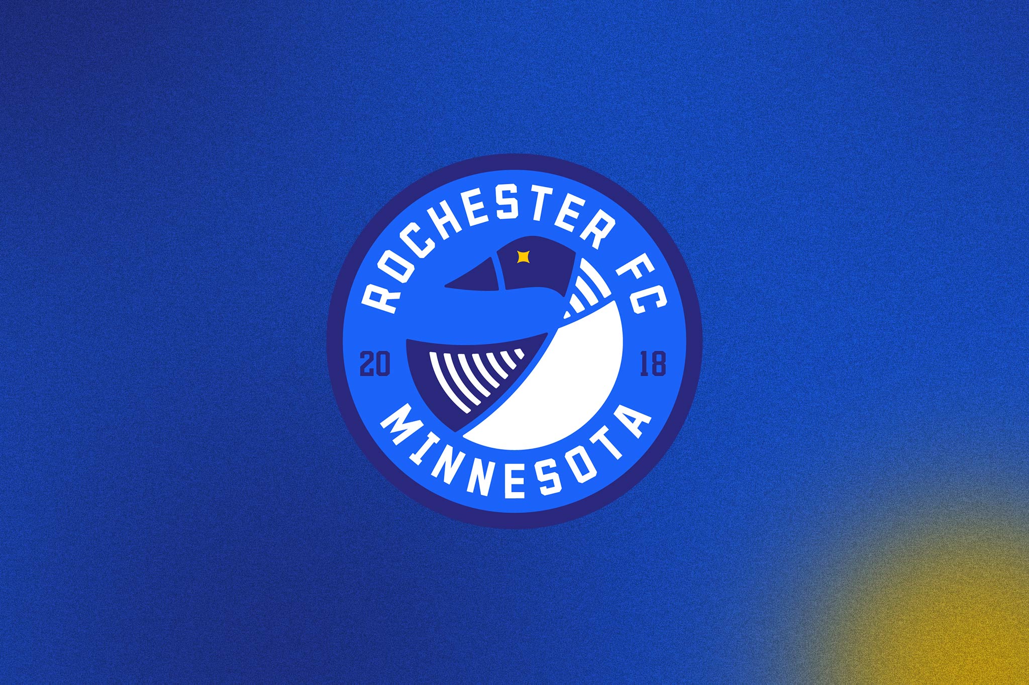
We worked with Rochester FC in 2022 to redesign the clubs primary crest. The primary objective was to keep the core elements of the original design but rework them into a more contemporary style. The Loon is a well known symbol for Minnesota so it was important to the club to utilise it as a primary symbol, whilst also being conscious of the fact that other teams use it in their logos, so it needed to be a unique design for the club. Our Loon design contains 11 stripes, one for each player in the team. It also has a yellow star marking the eye of the bird, this is inspired by the Bosnian flag as a nod to the club founders. It can also be lifted from the design and used as a separate design for merchandise and secondary kits. The Crest was the winner of the USL W & USL 2 "Best New Crest" awards 2023.